Pulse App
The music app with visual accessibility in mind.
Made in collaboration with Maya Tomasik
1.0 Overview

The class was asked to put themselves in the position of being part of a UX/UI design team for an interactive agency in San Diego tasked with designing a mobile app. Collaborating with 1–2 classmates, we will choose either iOS or Android as a foundation, and design the app from start to finish using Figma. The project involves creating user personas, wireframes, high-fidelity mockups, and interactive prototypes, focusing on usability, accessibility, and platform-specific guidelines.
Target Audience
Ages: 15 – 40
Country: United States
Tech-savvy users
Competitors
Spotify, Apple Music, Amazon Music, Pandora, Soundcloud, Tidal, YouTube, iHeartRadio, SiriusXM
2.0 User Research

Pulse addresses the common frustration with other music platforms being overwhelming, confusing, and lacking personalization. We’ve designed an intuitive and user-friendly interface that’s not only easy to navigate but also customizable to reflect each user’s personality. A standout feature is the ability to choose your own accent colors, making the app feel truly yours while maintaining accessibility and usability. This unique approach ensures a seamless and enjoyable experience tailored to individual preferences.
(More details in Figma file - Project 2)
User Insight (Summary)
Ease of Use
Users appreciate simplicity but struggle with cluttered interfaces. Some find content in the home screen overwhelming and wish for better navigation, such as adding a fourth tab or simplifying the layout.
Customization
Personalization is important. Users want more options for customizing their experience, such as adjusting audio quality, organizing playlists into folders, and adding users from contacts.
Most Used Features
Playlists and song discovery features like shuffle and radio are frequently used.
Pain Points
Users face difficulties with organization and navigation, including challenges with podcast tabs, playlist management, and deleting songs from playlists. They also want more streamlined ways to add songs to queues and access content.
Key Takeaway
Improving simplicity, personalization, and organization will enhance the user experience, making the app more intuitive and enjoyable.

Personalized Mix
Create your own playlist tailored to your preferences. Choose your favorite genres, artists, and songs, or explore beyond the given options with a custom search. The result? A unique playlist featuring fresh tracks made just for you.


3.0 Competitor Analysis
We conducted a competitor analysis to identify strengths and weaknesses in apps like Spotify. This helped us find opportunities to improve personalization, navigation, and customization in our own app, ensuring a more user-friendly experience.
(More details in Figma file - Project 1)
Main Objective
Spotify is a platform that offers digital music, podcasts, and videos. It has a free version with limited features and ads, while the subscription unlocks additional functions not found in other streaming apps. A standout feature is the ability to share music and listen together with friends. Personalized song recommendations further enhance the user experience.
Observations
01 | Overwhelming Personalization
While Spotify’s personalized features like Daylist and Blend playlists can be appealing, they can also feel excessive for users who prefer a simpler, more focused experience. The constant barrage of recommendations can clutter the app and detract from the core functionality.
Pros
“Daylist” playlists that change throughout the day
Annual “Spotify Wrapped” recapping a user’s music year
“Blend” playlists that combine songs both users like with new recommendations

Cons
Audio quality lags behind other streaming apps
Limited customization options
Restricts customization compared to the desktop version
Navigation could be improved
Difficult to see what friends are listening to
02 | Cluttered Navigation
Spotify’s navigation can be confusing and overwhelming, with multiple tabs, categories, and subcategories. This lack of clarity makes it difficult for users to quickly find what they’re looking for, especially when there’s an overload of content on the homepage.
03 | Limited Customization
Despite its popularity, Spotify offers very limited customization options. Users can’t fully adjust their interface or create a more personalized layout, making it feel rigid and less engaging compared to other apps that offer more control over the user experience.
4.0 The Design

Logo
Tagline
Moodboard
Primary typeface
Color palette


“Pulse” and the tagline “Feel the beat like it's your pulse” both highlight a personal connection to music.
“Pulse” represents the steady rhythm of the music, while the tagline emphasizes the high-quality sound and how the app makes the experience feel as natural and essential as your heartbeat.
Secondary typeface


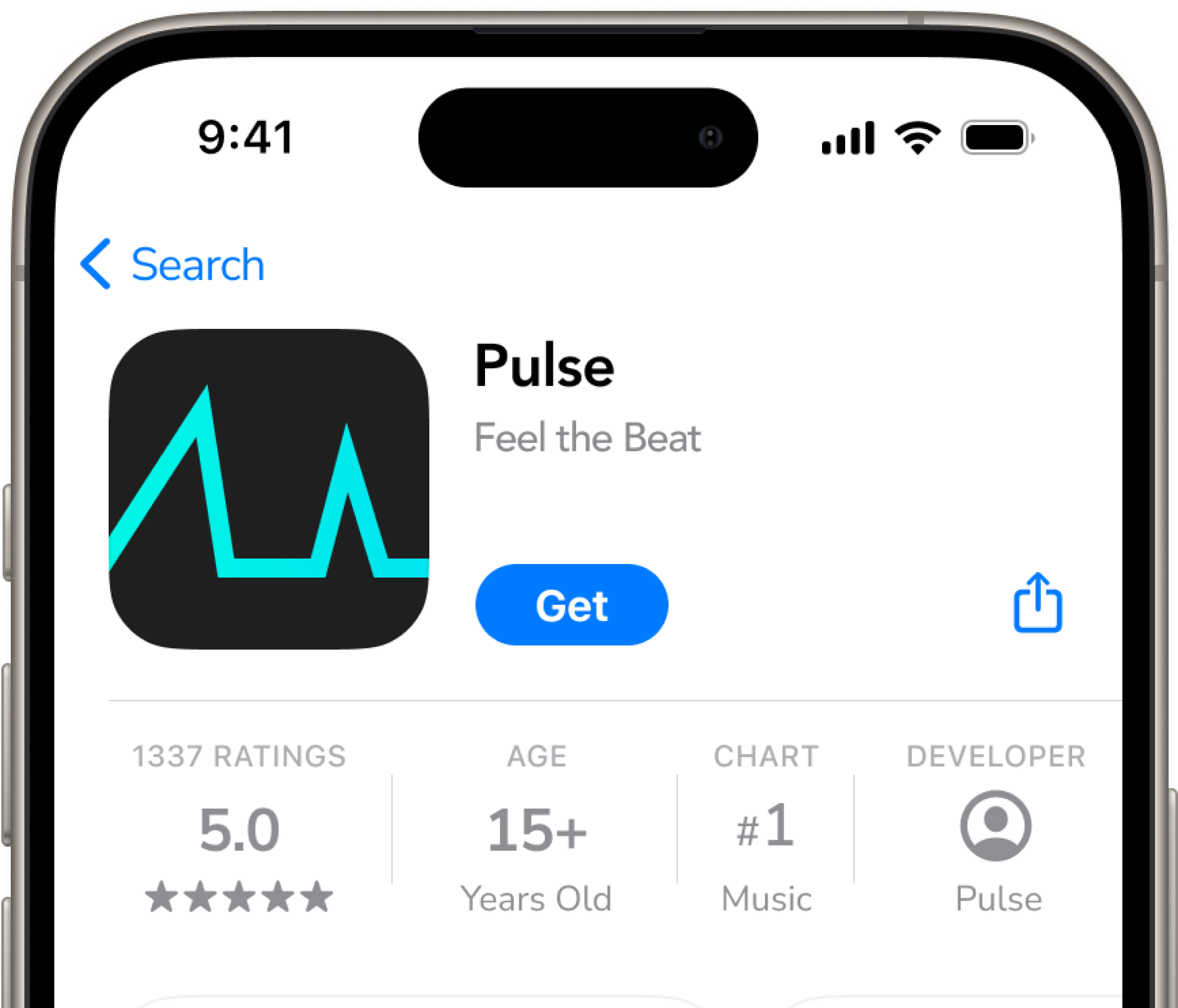
App icon
Pulsing sound waves
Embedded Figma file:
Project 1 (Competitor Analysis)
Project 2 (Personas, Wireframing)
Project 3 (Prototyping, User Testing)
Project 4 (High-fidelity UI, Design Systems)
Project 5 (Interactive Prototype and User Testing
Prototype